Lant Pritchett
Blavatnik School of Government, University of Oxford
Insight Note
On June 1, 2009 Air France flight 447 from Rio de Janeiro to Paris crashed into the Atlantic Ocean killing all 228 people on board. While the Airbus 330 was flying on auto-pilot, the on-board navigation computers’ speed indicators received conflicting signals, almost certainly because the pitot tubes responsible for measuring air speed had iced over. The auto-pilot turned control of the plane over to the two first officers (the captain was out of the cockpit). Subsequent flight simulator trials replicating the conditions of the flight conclude that had the pilots done nothing at all, everyone would have lived—nothing was actually wrong only the indicators were faulty. But the pilots didn’t do nothing.
One of the co-pilots pulled up on his side stick, which raised the nose of the plane and put the plane, already at high altitude, into a sharp climb. The climb was too much for the plane to handle at this altitude, even with the engines at full power. The plane lost speed and eventually the air speed over the wings was too little to sustain lift and the plane went into a stall. The plane fell from the sky at about 10,000 vertical feet per minute with the nose too far up, an “angle of attack” of over 30 degrees (in take-off this is only about 13 degrees).
My childhood friend learned to fly and got his first pilot’s license in high school and, since he needed flight hours, I would occasionally join him while he earned his qualifying hours. The very first time I flew with him in the passenger seat of a Cessna 152, which has dual controls, he explained the basics to me: “If you want to go up, pull back on the stick. If you want to go down, push the stick in. If you want to go down real fast, pull too far back on the stick.” I asked why this is so and he, a novice pilot, explained: “If a plane tries to go up too fast, it stalls, loses lift, and then the craft acquires the aerodynamics of a rock.”
What is both tragic and disturbing is that the 2nd officer puts the stick into nose-up position two seconds after taking control (02:10:07) and four seconds later the first stall warning sounds (02:10:11) as the speed of the plane slows as it attempts the impossibly steep climb the pilot has asked for. Given the dangers of a stall there is a loud stall warning. At 02:11:22, one minute and 15 seconds after the plane was put into nose-up position, the plane stalls and starts to fall from the sky. In the four minutes and 23 seconds between when the auto-pilot gave control to the pilots and the plane hit the water, killing all on board the stall warning sounded over seventy times. Yet in the cockpit recording as the pilots attempt to control the plane, none of the three pilots (the captain returned to the cockpit at 2:11:43 am) mention the stall warning.
Excerpts from the cockpit voice recorder of the 1st and 2nd officer make for tragic reading:
02:11:12 (1st officer): We still have the engines! What the hell is happening? I don’t understand what’s happening. 02:11:22 [Plane enters stall]
02:11:32 (2nd officer): Damn it, I don’t have control of the plane, I don’t have control of the plane at all!
02:11:47 (1st officer) (to captain): We’ve totally lost control of the plane. We don’t understand at all... We’ve tried everything.
02:14:23 (1st officer): Damn it, we’re going to crash... This can’t be happening! 02:14:25 (2nd officer): But what’s happening?
02:14:28 Cockpit recording stops.
Commercial passenger aircraft are one of humankind’s pinnacle technological achievements. Decades of some of the world’s top engineering talent have gone into every aspect of these planes, including the “dashboard” and the visual and aural information pilots receive. Commercial air travel is extremely safe (22 fatalities per million flights). AF447 was the first crash ever of an Airbus 330. Yet with all of the information at his disposal—and in spite of loud and persistent warnings—a trained commercial airline pilot never understood the connection between his action of putting the stick in nose-up position and what happened to the plane—something I learned in my first 30 minutes in a plane. In spite, or perhaps because, of an abundance of information being fed to them, the pilots lost conceptual control of the plane and they and 225 other people died.
Many country’s systems of basic education are in “stall” condition.
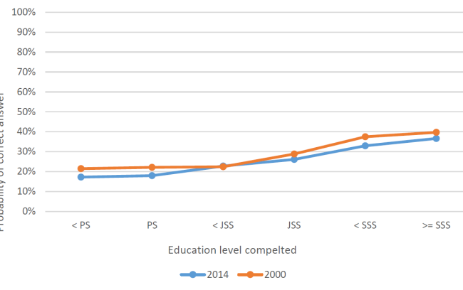
A recent paper of Beatty et al. (2018) uses information from the Indonesia Family Life Survey, a representative household survey that has been carried out in several waves with the same individuals since 2000 and contains information on whether individuals can answer simple arithmetic questions. Figure 1, showing the relationship between the level of schooling and the probability of answering a typical question correctly, has two shocking results.
First, the difference in the likelihood a person can answer a simple mathematics question correctly differs by only 20 percent between individuals who have completed less than primary school (<PS)—who can answer correctly (adjusted for guessing) about 20 percent of the time—and those who have completed senior secondary school or more (>=SSS) complete at about 40 percent of the time. These are simple multiple choice questions like whether 56/84 is the same fraction as (can be reduced to) 2/3, and whether 1/3-1/6 equals 1/6. This means that in an entire year of schooling, less than 2 additional children per 100 gain the ability to answer these simple arithmetic questions.

Source: Beatty et al 2018, Figure 4.8
Second, this incredibly poor performance in 2000 got worse by 2014. People at every level of education completed did worse in 2014 than in 2000. Not by a lot, but by a statistically identifiable amount. While the fact that it got worse is not the main concern, but one would have hoped it would get better. After all, between 2000 and 2014 lots of things got better in Indonesia. Between 2000 and 2014 per capita income more than doubled. Between 2000 and 2014 overall international rankings of Indonesia’s governance got better. Between 2000 and 2014 the country made a transition to stable electoral democracy (from a long history of authoritarian rule up until 1998). And, with a buoyant economy and responsive and more capable government, expenditures on education nearly tripled as the base pay for teachers nearly doubled. There were reasons to be optimistic but the data on learning say: Stall.

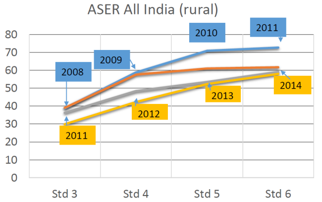
Source: ASER 2014
Indonesia is not the only country with stalling progress in learning. The ASER survey, which is a simple household sample-based assessment of literacy and numeracy, was carried out across rural India (with massive samples—500,000 households—so that it was representative at the district level) every year from 2005. Figure 2 shows the same deteriorating learning profile: children who were in grade 6 in 2014 (and hence started grade 3 in 2011) were less likely to be able to do a simple two-digit subtraction (with carry) than children in grade 6 in 2011 (hence started grade 3 in 2008). Learning per grade appeared to be getting worse. Learning data says: Stall
What has this got to do with education dashboards? The way large bureaucracies prefer to work is to specify process compliance and inputs and then measure those as a means of driving performance. This logistical mode of managing an organization works best when both process compliance and inputs are easily “observable” in the economist’s sense of easily verifiable, contractible, adjudicated. This leads to attention to processes and inputs that are “thin” in the Clifford Geertz sense (adopted by James Scott as his primary definition of how a “high modern” bureaucracy and hence the state “sees” the world). So in education one would specify easily-observable inputs like textbook availability, class size, school infrastructure. Even if one were talking about “quality” of schooling, a large bureaucracy would want this too reduced to “thin” indicators, like the fraction of teachers with a given type of formal degree, or process compliance measures, like whether teachers were hired based on some formal assessment.
Those involved in schooling can then become assessed with their dashboards and the “thin” progress that is being tracked, and easily ignore the loud warning signal saying: Stall!
India’s recent experience with basic education is a good example of a dashboard approach which both worked as designed and also went horribly wrong. As part of an increased attention to primary schooling, the national government launched a Centrally Sponsored Scheme to fund the activities of the States (who had constitutional responsibility for basic education) called Sarva Shiksha Abhiyan (SSA). As part of this scheme an EMIS (Education Management Information System) program called DISE (District Information System for Education) was launched. This was called a “report card” on schools and contains, for each district of India (aggregated up to state level) a huge "dashboard” of data about schooling. In the current State Report Cards 2016-2017 there are, by my count, 977 distinct numbers reported. Not one of those numbers is any direct measure of student learning (and interestingly, a previously included measure of learning was dropped from the “report card”).
The 2015/16 DISE data for Tamil Nadu can tell you how many teachers there are in government schools that only have primary grades (64,430), it can tell you how many children are enrolled in grade 6 with a hearing disability (1,540), it can tell you what fraction of schools with primary plus upper primary schools have a girl’s toilet (100%), it can tell you 761,872 scheduled caste children were beneficiaries of incentives for uniforms, it can tell you that 1.64 percent of female teachers are aged 57-58. The DISE is really an impressive effort at collecting and sharing data and has won several awards: for digital inclusion, e-governance, innovation, etc.
But about what a report card for what students actually know or can do or are being taught? Nothing. What fraction of girls in grade 4 can do subtraction? Nope. What fraction of children can Tamil with fluency in grade 5? Nope. What fraction of kids can tell time? Calculate area of a plot? Correctly follow instructions to mix Oral Rehydration Salts?
Calculate how much savings would accumulate at 6 percent interest in one year? No. And of course nothing about any higher-order skills like creativity, or soft skills like being able to work in a team.
So the dashboard contains data about every aspect of education other than whether it is accomplishing its purpose: to teach children the skills and competencies that prepare them to be successful adults.

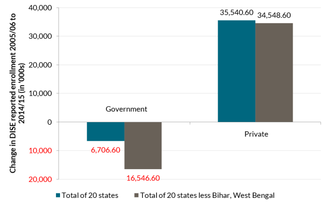
Source: DISE state report cards as reported in World Bank 2016, Appendix 2
The DISE does have detailed data on enrollment, including on the enrollment in government and private schools. What do these data tell us has happened during the period in which the Government of India and its partners have spent billions of dollars on SSA—exclusively to government schools? The enrollment data say about government schools: Stall (figure 3). During the 2004/05 to 2014/15 period, the enrollment in government schools fell in all but three of the 20 most populous states (Bihar, West Bengal, and Assam). In Bihar enrollments increased by almost seven million and in West Bengal by almost 3 million. But, outside of those two states, enrollment in basic education in government schools fell by 16 million students. The total number of students in the UK is about 8 million—so twice as many children in India left the public sector over 10 years than are in the entire schooling system of the UK. But the total enrollment went up substantially as enrollment in private schools increased by 35 million, so in total enrollments increased by 28 million.
During the period SSA was being implemented, which increased central government spending on basic education by more than a factor of ten and increased overall spending in government schools per pupil by a factor of three, measures of total spend per pupil showed the government schools spending about 2.5 times more per pupil than private schools (Aiyar and Pritchett 2014). And the “thin input” metrics measured in DISE did improve in many instances: the infrastructure measures improved, pupil-teacher ratios fell. On measures of process compliance and thin input expansion SSA could be judged a big success. But there is evidence that both enrollments and learning fell over exactly this same period while SSA was, on its EMIS dashboard metrics, a big success. Stall.
Providing information and data that does not contribute to conceptual understanding of the functional operation of the system does not help—and can hurt through distraction.
Those piloting AF447 were getting lots and lots of inputs. If they had paid attention to only one of those inputs—the stall warning—they might have understood they needed to push the nose down to gain speed and regain lift. Those managing the education system in Indonesia and India were not lacking data or information, they were lacking an understanding of what to do that would improve system performance. For that they needed a correct causal model of the operation of the system and then, and only then, could one collect and interpret the right information.
Providing information on inputs that don’t have a clear causal connection to outputs and outcomes does not help—and can hurt through distracting efforts.
The old saw is that if you have more than three priorities, you have no priorities. What if your “report card” has 977 items? If improving any one of these (e.g. students receiving incentives, pupil-teacher ratio, percent of schools with playground facilities, transition ratio, educational qualifications of teachers) can be regarded as a program goal, then one can, as they say, happily rearrange deckchairs arranged on the Titanic. For instance, included under the label of “performance indicator” is “pupil-teacher ratio”, presumably with the notion that lower is better. But in a number of Indian states, the pupil-teacher ratio in government schools was falling because the number of students was falling while the teacher force stayed more constant. So this was actually an indicator of a stall in school quality, not an indicator of “performance.”
Actions are often interactive in their impacts and hence the system can respond differently to the same input depending on other features of the system.
One of the pilots pushed engine output to its maximum, but he didn’t know that the other pilot has his stick in an excessive nose-up position. With the “angle of attack” created by one pilot, even at maximum output the engines could not keep the plane from stalling. Education systems are large, complex, adaptive systems and there are few actions that have linear, non-interactive impacts on outcomes. Indonesia doubled teacher salaries over 2000 to 2014, but both a randomized evaluation (de Ree, Muralidharan, Pradhan and Rogers 2017) and the aggregate results from Beatty et al. (2018) show there is no evidence of any impact of that additional spending on learning outcomes. This is not to say teacher salaries are not important, just that they need to work together with other components of the system to have impact.
This is not of course to say that all dashboards are bad. But it is to say that not all dashboards are good. A bad dashboard which gives misleading confidence to actors on what should be done based on an incorrect conceptual understanding of causal connections in a complex system, and dashboards that redirect attention from actual indicators of outcome performance toward top-down “thin” inputs and process control, can actually be worse than no dashboard at all. A good dashboard is possible, but hard. Metaphors are powerful, for good and ill, and we cannot let a powerful metaphor like a “dashboard” get ahead of the reality of the need for understanding education systems as complex adaptive systems.
Pritchett, L. 2018. The Risks of Dangerous Dashboards in Basic Education. RISE Insight. https://doi.org/10.35489/BSG-RISE-RI_2018/006