Emilie Berkhout
Amsterdam Institute for Global Health and Development (AIGHD)
Blog
In our previous blog, we discussed recent policy changes to shift junior secondary school admissions to those based on house-to-school proximity instead of the Grade 6 exam score. We showed that when Yogyakarta implemented this new admission policy, colloquially referred to as the ‘school zoning policy’, the student composition changed significantly. Many students with lower test scores and poor students who had not been previously admitted to public schools were now attending them, substantially improving equity in access to public schools. For students that scored in the bottom 40 percent of the Grade 6 exam score distribution, access to public schools more than doubled, specifically, 29 percent was enrolled in public school before the zoning policy while 66 percent was enrolled after implementation of the zoning policy. This blog shows that despite a higher enrolment of low performing students in public junior secondary schools, many students did not attend the best quality public school they could attend. We find that this is not due to the failure of the zoning policy per se, but rather due to low performing students self sorting into lower quality public schools. We further explore the underlying reasons for why this may be the case.
Recall from the previous blog that students did not have to apply to the closest school to their house, even if they had the highest chance of being admitted to that school. While 76 percent of the students that applied through the selection round based on house-to-school distance were enrolled in their top school preference (93 percent in top three school preferences), only 23 percent were enrolled in their closest school (66 percent in one of the three closest schools).
To identify which schools the students would have gotten into had they applied to their closest school as their first school preference, we simulate the student allocation following the City’s guidance on admission according to proximity. We allocate students who are enrolled in the public schools through the selection round based on house-to-school proximity by assuming that their school preferences follow the distance from their house to each school. Our simulation allocates 81 percent of the students to their closest school (91 percent to one of their three closest schools). All students apply to their closest school in our simulation, but students who live even closer might have already filled the seats of that schools. Therefore, not every student is allocated to their closest school.
To compare school quality between the simulated enrolment and where students actually enrolled, we use the school rank in terms of average Grade 9 national exit examination scores before the zoning policy as proxy for school quality. We rank the 16 public junior secondary schools in descending order, such that the highest achieving public school has a rank of 1, and the least achieving public school is ranked 16.
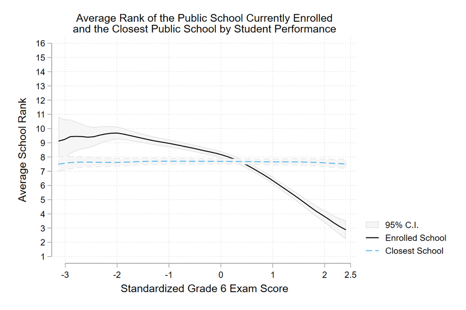
The figure below compares the average school rank of the simulated closest school to the school in which the students were actually enrolled, by their standardised Grade 6 exam score (such that the mean is 0 and the standard deviation is 1). The dashed horizontal line indicates that the closest schools were of similar quality across different types of students. This illustrates the diversity of students living close to the public schools and confirms that the zoning policy has the potential to achieve an equitable student allocation. However, the black curve shows that, in reality, students with a below-average Grade 6 exam score were enrolled in schools with a lower rank than their closest school; about one rank lower on average. Conversely, students with an above-average Grade 6 exam score were enrolled in schools with a higher rank than their closest school. For instance, students that scored two standard deviations above the mean Grade 6 exam score were enrolled in schools that ranked four places higher than their closest school, on average.
Throughout this blog, we focus on differences by student performance on the Grade 6 exam score, but the results are similar if we use a standardised asset index as a proxy for wealth. Hence, relatively poor students were also enrolled in schools with a lower rank than their closest school.

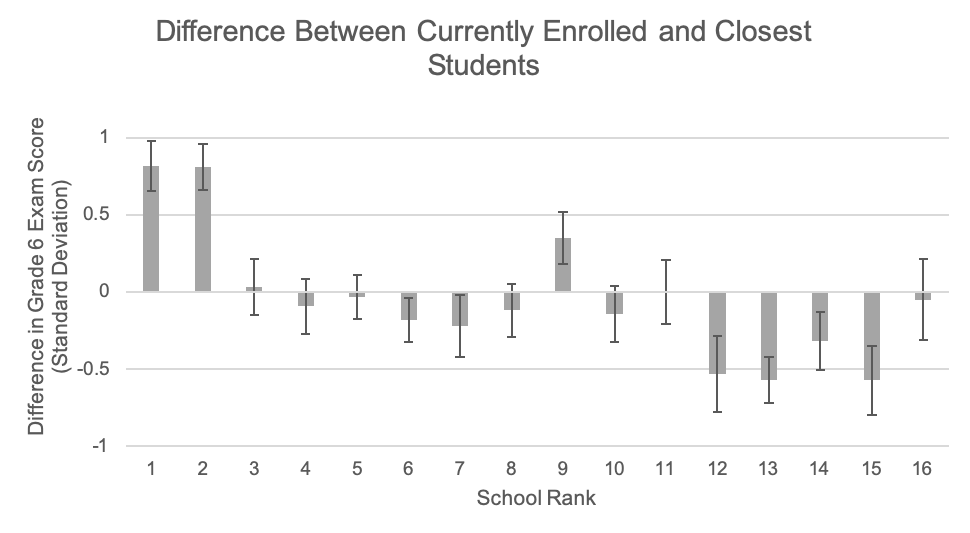
At the school level, the zoning system resulted in more clustering in terms of test scores than we would expect if students were allocated by proximity. The bar chart below shows the difference in the standardized Grade 6 exam score in each public school between the actual enrolled students and the simulated students, and the 95 percent confidence interval. The student composition would have been similar if the students who live closest to the schools applied to and enrolled in the respective schools. However, students enrolled in the top two schools had a 0.8 and 0.9 standard deviation higher average Grade 6 exam score than the closest students. At the same time, students enrolled in schools with lower ranks generally had a lower average Grade 6 exam score than we would expect. Hence, despite the potential of the policy to achieve an equitable student allocation, high performing students still sorted into the best public schools, whereas the low performing students sorted into public schools with a lower rank.

Note: The bars do not add up to zero, because the seat capacity of the schools varies. The schools that rank first, second and ninth have 654 seats in total and the schools that rank twelfth, thirteenth, fourteenth and fifteenth have 663 seats. The mean difference weighted by the number of seats is zero.
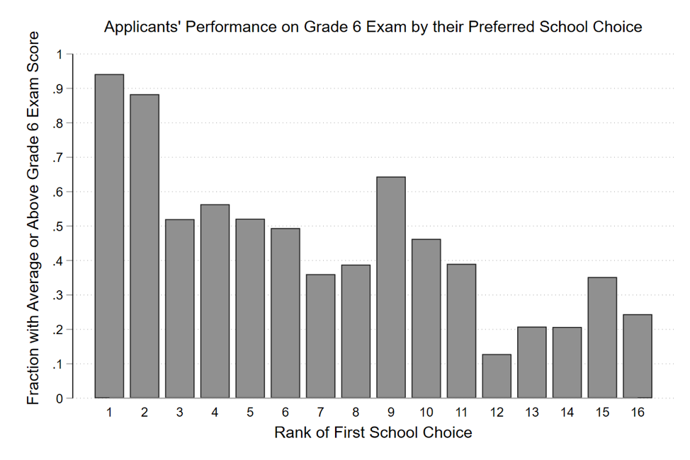
The differences in the student composition between actual enrolment and simulated enrolment arose from student preferences rather than school’s rejection of low performing students. To illustrate this, the next figure shows the fraction of students that applied for the selection round based on house-to-school proximity that had an average or higher Grade 6 exam score by their first school preference. Of the students that listed one of the top two schools as their first preference in their application, 91 percent had an above-average Grade 6 exam score. Meanwhile, the students that applied to the other public schools were more diverse. If we look at it the other way around, only three percent of all the students with a below average Grade 6 exam score listed the top two schools as their first preference (not shown in the figure).

We hypothesise that students with different performance on the Grade 6 exam had different school preferences because students sorted into schools. Students seemed to select schools with students that were academically and economically similar to them. Our qualitative work found that parents of high-performing children believed that the school culture and who their children associate with will shape their children’s academic achievement.
It is unlikely that the difference in school preferences came from misinformed parents. The school ranks are well known in Yogyakarta because of its reputation in education. The top two schools in Yogyakarta even ranked among the top five schools in the country in terms of Grade 9 leaving exam scores. Moreover, our qualitative work revealed that low performing students had good reasons not to apply to these schools. The top schools implement an ambitious curriculum and parents mentioned that they were afraid that their children may not be able to keep up with the learning pace. While one of the schools refused to adjust its curriculum for low performing students, the other tracked the low performing students and retained them for an additional year. Moreover, parents mentioned that these schools often request money from them to finance school activities, even though public schools are supposed to be free.
While our first blog shows that the new admission policy is equity enhancing in terms of improved access to public schools for low performing and poor students, this blog reveals that equity in access has not yet been reached for the top-ranking public junior secondary schools in Yogyakarta. However, there is room for debate about what the optimal outcome for poor and low performing students would be, as our qualitative work found that these students had good reasons for choosing less highly ranked public schools. Moreover, the evidence on the effect of elite public schools on learning in other countries is mixed. It is a question that we aim to answer with the continuation of our research in Yogyakarta for the RISE Programme.
RISE blog posts and podcasts reflect the views of the authors and do not necessarily represent the views of the organisation or our funders.